Showing posts with label 3D Pixel Art. Show all posts

Tuesday, 21 January 2014

Minecraft me and stufffor a 4j studios interview...

Hello,

Yesterday I was lucky to be contacted by 4J studios to ask me if I would like to come up for an interview..

my answer was a rather resounding, yes!

So, I decided to prepare myself quickly for 3D pixel art by going over what I had done in 4th year...

3D pixel art

But, since I havent played around in maya I decided it would be fun doing a quick texture for steve and making him me...

(modelling/rigging wasn't by me)

me


texture

Also, a little tiny card game update for you...


this is the new item picture for the consumable, "tidal wave" still not 100% but think its a great deal better than the old one.


Tuesday, 7 January 2014

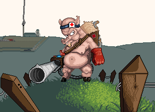
Game art assets : day 5


So here he is by the end of today, And the main changes were for the grass however i was starting to get bored so started on the lay out for the background.

still thinking the pigs waiting looks a bit awkward but I kinda dont want to make any huges changes to it yet think the barrel needs to be a bit more top heavy (so the barrels pointing to the ground) would prob make it look better too.

tomorrow i might take a break on the pig and start thinking about the card layout maybe get some item cards designs down and put them up.

anyways thanks all who read this...

Dam90

Saturday, 27 April 2013

Honours Project: Classic level 3 and the abduction of hybrid

Hello again,

So today was a rather slow day which begun with what could be considered a fail....

So I shall start with the bad,

So in my calender I had these 3 days to get my 3D pixel art 'Hybrid' style stuff done, however 7 hours into the day and I had made or atleast felt like I had made no real dent into the first level of the style, this led onto the consideration in negating the style from my project altogether so i shall discuss why in greater detail....

(this section could probably be considered personal developement)


So in the first level (space) I was wanting the planet to revolve, which would be a very easy and obvious way of showing the third dimension.

I finally managed to figure out 3ds maxs toon shading nad getting it implemented so that the render would render out a rough outline of 1 pixel thick. (instead of having to put one in completely by hand)

this saved me (some) time i think however the outline still needed cleaned up and textures needed to still be fixed pre rendered, I was trying to find a good medium between a really fast jerky turn around and a super smooth turn around and ended up with 24 however at about quarter of the way through endlessly zooming in and fixing an outline just because it moved a pixel or so from the previous line was taking far too much time for no reward.

Now this time could be used to make other styles better for example the stylised levels animations more fluid, 

I am not ethusiastic as being a 3D artist so i dont see it being dentrimental to me in the future, and hybrid can stay as a part of my dissertation to look into further.

I have emailed ryan to hear what he thinks hopefully he agrees, it would be nice being able to focus on other styles more and doing something that enjoy more...as i think Hybrid style alone would be too much to get done in the 2 or so weeks untill submission...

Anyways.....

So moving on... I got to work at doing the levels for the Classic style.

Classics main advancement over vintage is the inclusion of more colours and this is the bit that i wanted to show in my levels.


level 3 - spritesheet


Original size: 16x16 special (64x64)

 Idle

Jump

Punch


Special


So along with more detail added to the character i added more detail into the animations, most notably the hair.

as always if you got something to say about anything in this post feel free to leave a comment...

Sunday, 14 April 2013

Honours Project: progress update

Hello,

My my my not posted anything for a while not good atall.

So yes I havn't vanished, and still working away on my pixel art stuff.

So last time I was talking about how ryan wanted to see how i would display my timeline.. Unhappy with the presentation powerpoint feel that timelines gave i wanted mine to be more interesting and interact with the user in some way.

I am terrible with coding however and although I could have probably struggled and conjured up something in flash. I got chatting with a coding chum over a few pints and the subject inevitably came up about my project, anyways one thing lead to another and he agreed to do all the coding for it, this would be awesome as it would save me a ton of time doing something i really don't like and put my attention to the project/dissertation writing. also with the added opertunity of being able to get my stuff on my ipad which would be great another screen for people to see my stuff at the exposition.

So a big thank you to Stuart howieson for helping me out,

so now that i have someone else i thought it would be a great idea to sketch out what i wanted and explain everything so that he could then code everything. Then everytime i complete something we can just add it in with no problems.


basic layout (of how i see it looking a at the last stage)
the dotted arrows represent being able to drag/click drag in that direction to see other planets (however this depends entirely on whether or not i have the time)
each star represents a different style click/tap on one and the style will switch to the one you selected.
second image is the story board


  • title screen just says pixel art style my name or some baws (might have some animation depending on time) but we will see just tap and then...
  • KERBLAMO! transition to the first vase is that of an explosion "big bang if you will"
  • vintage style: clickable stars will pulse or something when you hover of them they will say which style it will change it too so at this stage theyll only be two clickable stars vintage ( the one we are in now) and classic the next stage click/tap on it then a cool animation or something will happen...
  • classic style: same but theres now a new clickable star ... 


  • i was thinking that you could click the planet or something and that will show like the creative process of each style or more things like characters or something but i dont think al have the time for that atall.
    So i have also been quickly knocking up some images of each style:

    I appear to have misplaced the other styles that i have done my apologies i shall edit them in when i find them.

    Quick 3D mock up still more detail needs to be added


    volcano with toon shading on


    volcano Texture simplistic


    Tuesday, 12 March 2013

    Honours project & Presentation : timeline progress for presentation & a sketch

    Hello, we have a looooooong post for today, but i have alot of pictures for you to look at so lets have a blast..

    So Presentation day (again) so I have been getting my slides or atleast what i want to say together.

    So basicaly since my project idea has changed I want to explain why,

    Sor right off the bat, the general consensus of my showcase didnt come across well enough, like what i talked about in an earlier post me and ryan discussed a more final and coherent way to showcase my showcase and to do this we discussed an idea envolving a timeline of the styles and there introduction not showing dates or anything like that.

    The more I thought about it the more i liked the idea and that in a way I was doing it subconsiously, My critical framework broke down images of pixel art and placed them into 3 different "styles" of pixel art.

    I also mentioned in my previous presentations that i feel the most valuable part to pixel art is that it ages better than its 3D "realistic" counterparts, the reason for this to me is that pixel art borrows or works in the same way of its traditional art abstract relatives.

    For example:


    Proteus (2013) a pixel art/3D game about exploring a new world. People who play the game become immersed in the world for hours on end despite what can be considered as its abstract blocky looks.


    Skyrim (2012) a realistic fantasy game about exploration (of sorts) this game has heavy praise of it graphic fidelity and realism (well despite the dragons and all the other mystical creatures) people become immersed in the realistic world for hours.

    The problem with realism to me and many peers is that since its so focused on realistic graphics that it becomes the foundation behind the reason why you get immersed in the experiance, but 5-10 years from now the realistic graphics will move on to bigger better and more HD places leaving skyrim looking a bit worse for wear as its mascara begins to run.

    Let me show this happening in visuals, Battlefield. I chose this franchise as its one of my favourites and one which i have played and loved from the baginning in 2002.


    Battlefield 1942 (2002)

    2 year old me: "Wow, Look at those graphics thats some realistic brown going on there"

    Disclaimer: i may not have said it but something along those lines definately crossed my mind.


    Battlefield 2 (2005)

    15 year old me: " Holy S*** its like being outside and holding a gun in real life"

    Disclaimer: sorry for the language, teenage hormones and all that.

    Battlefield 2 was also the first game that i ever experianced that my PC  at the time wasnt able to run at full specs yet i was still blown away by it.


    Battlefield: Bad Company 2 (2010)

    I remember seeing this being shown and was amazed the new frostbite engine dice created for this was intense, on its highest settings it still looks pretty good...

    ... Until you play this...


    Battlefield 3 (2012)

    The most recent battlefield game, and considered one of the most realistic modern warfare games ever created and has the ability to bring a gaming rig to its knees.

    look back 7 years ago and what looked pretty then looks horrible now...

    and that change has an effect on an aesthetic level atleast.. its missing its realism that it touted before and more importantly what you remember it looking, in away its the negative impact of nostalgia than that of what pixel art has, and i think thats due to the abstract art side at play.

    So where was I...

    Ah yes, timeline...

    So in my timeline of pixel art styles (working title) Im going to show you that pixel art holds on by showing you all the styles as they are introduced.

    as this was a brand new idea i thought i should conceptualise it with existing images of games that used the style,


    As you may be aware thats the image i posted up in the post before,

    But using my critical framework (which is now in need of an update) i listed the different styles of pixel art as i named them ( i couldnt find anything that has done it before yet )

    • Vintage - the really old stuff black and white made up of simple blocks occasionaly a third coulour is used usually green.

    • Classic - The colour palette and the resolution has increased however detail is at minimum colour is flat no shading etc

    • Retro - This is one of the styles we think of when we think of games, the 8 bit era of games more pixels have been added along with a much larger colour palette giving you more detail yet still not enough for things like a full face on characters where certain features may have to be increased to hide the lack of others mario is a good example of this
    • Old School - Often mistaken as retro/8-bit but old school represents the 16-bit era which is a noticeable increase in pixel density and colour gives it a sharper and more detailed look as characters begin to take more shape as the detail is increased enough

    ~ Introduction of the polygon ~

    • Classic/Modern - a contradictory name for a style i hear you mutter, well the reason i called it this is that it uses all the same restrictions as classic the resolution restriction and colour limit remains intact yet the choices of what colour the limits are are completely upto the artist in question.
    Example of a Classic/Modern style:

    Passage(2007)

    • Stylised - Probably the most common of pixel art styles mostly pioneered by Paul Robertson, the artist is free to use what size of resolution is used but usually no bigger than 128x128 is used, but can be expanded after. The pixel art is probably quite similar in appearance with the likes of cartoon drawings. this also gives an artist to throw in his/her own uniqueness to his/her art.
    Example of stylised: 


    Kings of Power 4 Billion % Paul Robertson


    3D Pixel Art

    Voxol - 3D cubes

    3D Dot Game Heroes

    Simplistic - Simple 3D geometry with pixel art textures


    Minecraft

    Hybrid - 2D sprites simple 3D geometry or 3D post manipulated

     
                 Bit.Trip Runner                                                                                      Fez


    These are the primary styles in my eyes but there can be overlap.


    So lastly...

    Thinking of a way to represent my timeline in a cool way, i thought a part of it can be told using a short animation /story (maybe even the full thing but we shall see...

    I had the idea of something mining out a cube to represent the "polygon"... that led to me drawing up a concept image of a dwarf, I have a fascination with dwarves im unsure of why probably stems from my childhood.


    Its been a while since i have drawen something so high rez haha...

    but i think hes cool.

    What do you all think, about EEEEEVERYTHING, like the sound of it or got any questions leave a comment and al get back to you :)

    David M


    Thursday, 28 February 2013

    Supervisor Meeting Diary: 28/02/13

    Hello,

    So been a busy week for me after recovering from the cold, i have also became deaf in my left ear and it hurts from time to time. Also celebrated my 23rd birthday party on tuesday so that was fun and pretty hectic.

    But now things have settled down and the realistation of hand ins has came crashing down on me and now i am in a state of panic.

    YAAAYYY!!!

    But,

    Today I had a meeting with Ryan which was good, we talked about my results and what i was planning to do for my final project.

    We came to the conclusion that the reason why I am struggling so much is that I am still not sure what i am doing.

    so here is my meeting agenda:


    • presentation ( since we couldnt meet up the week after my presentation and i had some questions to ask about it i wanted to discuss things then )
    • Semester 1 results: damaged my motivation and im struggling to inspire myself to do work

    Agreed action points

    after discussing the agenda we came up with a few but very important things for me to do,

    1. Get an idea for the final project
    2. Conceptualise that idea to show to Ryan  on 07/04/13
    3. Tell Ryan, Why are you doing the project and how are you going to do it

    Also as a side project i keep laying it off but i MUST make a start on this dissertation by the end of this week i plan to have it blocked out at least

    Sunday, 10 February 2013

    Personal Development Portfolio: 3D Pixel art character

    Hello,

    So following on from my previous attempt I decided to try touching up my renders in photoshop, with flat colour textures.


    I wanted to move away from the lorry and try with something thats flat textures and a bit more complicated like a character.

    Not wanting to spend my time with modelling etc, I decided to go with a model from team fortress, following from my previous attempt:

    http://dmhonoursproj.blogspot.co.uk/2012/11/concept-development-3d-failings.html

    reasons behind this is they are already modelled and uvd and textured with a flat colour cell shaded texture.


    So yeah using the rendering methods stated in the previous post i rendered out the model at 128x128 pixels


    As you can see by the enlarged image unfortunately i havnt snuffed out AA completely. However I sorted this as best i could and gave the image an outlines and added highlights and shading.


    As you can see this gives a 3D model a pixel art look.... couple of issues:

    1. the model is still more complicated than necessary.
    2. more time will be saved when i find a way to get rid of the AA in my renders completely

    So next up would be model my own simpler character and possibly a spritesheet/model rotation animation. something like this from polycount.com


    http://www.polycount.com/forum/showthread.php?t=97311#9, 
    http://forums.tigsource.com/index.php?topic=74.msg736603#msg736603

    Saturday, 9 February 2013

    Personal Development: 3D Pixel art progress

    Hello,

    So I have made further progress in making my 3D models render more like pixel art,

    Following on from that thread posted on polycount I have been playing with my render settings to achieve pixel art rather than making Pixel art textures and leaving it at that. Problem with this is that it didn't look like pixel art to me.

    so...


    This is how my stuff looked originally.


    Top : Pixel Art render techniques on
    Bottom : original model

    So this is whats changed along with the alterations made on the texture filter etc I have reduced the render resolution, added an outline and turned down the AA as much as I can.

    The pixel art looks far better however there is a few issues,

    1. The pixel art texture may now be too complicated
    2. The AA is still on this is what is making the strange jaggies most notably on the lettering.

    So, possible fixes, I could give the texture flat colours then doctor each render image to add detail etc advantages of this is i could add more detail in the model disadvantage is having to doctor each frame ( for a simple turnaround animation that would be like 255 frames. Finding a way to get rid of AA completely would help greatly and there has to be an option in there somewhere.

    However, with all this editing and altering after render I dont see this working in say a game engine, however im not giving up yet and will prob work on this method further to see if I can improve my results.

    UPDATE:

    AA has been improved upon in render,


    As you can see the texture has came out better less jaggies or what i have started to call them 'teeth' on the letters etc has been significantly reduced however the ones that are there can be removed due to the positioning of the camera. annoyingly the outline still gets AA no matter what i do it appears. this could be sorted by removing it then doing it in the Post render stages. however this might increase the time, it would take.


    Wednesday, 6 February 2013

    Honours Project & Personal developement: environment development Improved texture quality

    Hello,

    Well today I have been doing more of my 3D stuff,

    So first off we will start in the beginning with my skyscraper and truck,


    So as you can see if you zoom in the model the textures are blurry, I thought this was just due to the texture size and the higher the texture the crisper the image would be.

    However this was not the case the texture on this is a resolution of 2048x2048 which is a massive texture (thankfully my pc can handle it perfectly fine) but this would not do,

    So i went to google and searched for answers...

    I came across this post from a forum,

    http://www.polycount.com/forum/showthread.php?t=97311

    In summary this was a method to produce crisp textures etc by playing about with the texture & render settings but in 3Dsmax i needed similar options in maya..

    further research brought me to making these setting changes:


    • Switch off AA 
    • In your texture settings in the file attributes turning the filter off in the filter type option
    • Change your hardware texturing settings and set the texture filter to nearest (unfiltered)


    This makes your texturing crisp, 


    Like so,

    This is zoomed right into the trucks headlights,

    After that I started to texture my environment,


    so apart from a few areas the texture is ok (not too happy with the leaves might need more detail)
    you may notice that if you zoom into the tree model it still blurs, that just seems to be something to do with p3d.in not supporting it, not sure.

    Anyways, im going to look into getting my pixel art onto 3d models more effectively now that i can see its definitely possible, also get a nice pixely outline around my models


    EDIT: ok I have found out you can also turn it on in the P3D settings haha, i kept it off for the truck just so you can see the difference