Sunday 12 May 2013

Honours Project: Critic of final work.

Hello,

So the past couple of weeks has been rather hectic but i have finaly managed to get my project done, so i thought it would be a good idea to have a final critic of my work.


So here is the final version of my project working on my timeline, apart from some memory crashes it works perfectly fine. 

so going to take this opportunity to thank Stuart howieson for making this possible and coding this for me to focus solely on my pixel art.

So, I am going to talk about each style and level individualy discussing what works and the bits that dont to well.

First up ~Vintage,

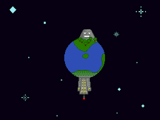
 planet - lvl1
 landscape - lvl2
character - lvl3

Vintage: Since it was created originally on early game consoles in the 70s and 80s everything was very basic 2 colours low resolutions and limited frames for animations as stated in my critical framework.

Since I am doing a more post modern approach to try update the style but still keeping its character I made some changes. i kept the colour pallette the same reminiscent of games like space invaders. I kept the frames relatively low in the animations until it came to the special,


However despite being rather limited in detail i think its still rather striking and nearly hypnotic. I think this is the simplistic nature of the style.

Planet - Lvl1
Landscape - lvl2
Character - Lvl3

Classic: The changes from vinatage to classic is that of colour how the resolutions and frames are still rather low. 

This makes the character more defined I deliberately made him/her hard to sex, this was because i wanted to keep it so that it was upto whomever who the character is. 

I would also point out i made an error i think i made the city part of landscape to detailed which made it a problem for later on.

Also feel the need to point out the reasons why the special is so over the top is because i wanted to show people in the most basic way why i am attached to pixel art it still has its unrealistic over the top childish nature things didnt really need explained people just went with it.


I think my approach to the classic style went rather well and represents the style well.

 Lvl1
 Lvl2
Lvl3

Retro: more colours gave characters and landscapes more detail and depth animations could also have more too them and the characters taking more of a resembelance to an actual person.

apart from some animation niggles that due to several reasons havnt been fixed, this style went rather well and you can see a step from the previous styles.


The crazyness of specials was toned down too, i like the arm changing at the initial flash his other arm annoys me and looks a bit abnormal.


Old School: The last original style before 3D started to become the new industry standard another step up in colours its most notably recognised however by the shading.


so yeah overall old school went relatively well however as you can see i was struggling to make the city really stand out however the nature side is progressing in each stage rather well.

last but not least stylised...


Stylised: Stylised is pixel art that is made with the complete freedom of colours and resolution. however usually the highest any pixel art goes is about 200x200 pixels anymore then it can be rather laborius and time consuming

unfotunately if i was going to be really honest despite the fact i like the general look of these styles some of it being the best pixel art i have done the animation has alot to be desired i was intending on fixing these but during one night of extreme tiredness i saved over the animation file and i hadnt the time enough to amend this.

however overall im extremely proud of what i managed to achieve in a rather short time it did feel like for the first half of this semester the world was out to get me but i have made it and genuinely looking forward to see what people make of it.

David M


Saturday 11 May 2013

Exposition: Showcase idea.

Hello,

So my honours projects about 95% complete and my dissertations coming along so i had time to think about how im going to show it at the exposition.

so lets get right to it so heres the concept of how i want my wall to look.

ok, so first up i thought it would fit well to keep thing retro of the time pixel art came from so i went for nintendo iconic handheld the gameboy. the graphics for it such as the buttons screen and the 2 lines at the top would be spray painted on. (checking to see if thats actually allowed) if not i will print them out depending on how expensive it would be.

  1. title ( This would be my name in the actual showcase)
  2. poster this will be a mock image as if my project would is on a game cartridge
  3. same poster as above but it shows how i broke down pixel art games and categorised them into there corresponding style.
  4. statement of my project most likely the abstract from the dissertation
  5. each of these black squares represent an actual nes cartridge with images of each style. (this is only if i can find 5 rubbishy nes cartridges that i wouldnt mind taking apart etc. if i cant find then one of them would prob be placement of my wall mounted business cards


Friday 10 May 2013

Updates: checklist

just the usual what i have done, things i got to make some improvements too and what i still got to do.


Exposition: Business cards old and new ... and whats going on?

Hello,

So now that my honours project is nearly done i can focus how i am going to present it at the showcase.

first up business cards,


so i got these first, when i was worried about the direction my project was going and felt i should get these so i didnt have to think/worry about it.

however i soldiered through and got a fair whack of my work done so much that i thought that the business card wasnt really unified with what i was showing. despite the extra cash i think the decision to get more was a good one. (not that there was any significant problems with the ones above


however im still unsure how i am going to present my work on my corner of the wall.

i do have an idea that my wall have posters showing each style,


however im not sure as this is my final work and ive been told that the stuff on your wall is developement stuff so going to have to think about it a bit more

Personal Development Portfolio : Relection

Pdp reflection


For our honours year we had to record our personal developement throughout the year, we had to establish our skills that we felt we needed yo develop for me these were.

Sketching - although i wouldnt say its my weakest points i definetely felt i needed to improve my traditional drawing skills especially the human body.

Photoshop - despite having used it for over 3 years i still felt that i knew very little and it was having an impact on my digital work.

Graphics tablet - this is a small extension and a rather small thing, but i wanted to improve my work using graphics tablets. I usually draw a concept sketch first using pen and paper and scanning it in. 

Maya - what would prob be considered as my achilies heel, i dont really like 3d modelling and the only thing i really like is the animating on maya. Theres alot of things people mention in maya and just assume you would know but it is still another language to me. Maya isnt that significant to me as i dont see me becoming a 3d modeller but i do enjoy texturing stuff/animating them

Pixel art - the big one, and the most important to do with my honours project, for obvious reasons. My grand total of pixel art prior to this project stood at the grand total of 2 possibly 3 as concepts for a game i was intending to make over the summer but before that i always had a fond memory of the technique but up untill now never got round to actually look into it seriously.

Sketching

So throughout the first semester, i attended life drawing classes to try improve my traditional drawing skills.

 with added strawberries


apologies for the quality of the images

My understanding of the human body has greatly improved due to these classes and im disappointed in myself that i didnt continue on after the christmas holidays. This was due to being more focused/worried about my project.

Photoshop

Using photoshop has greatly improved for me, as my efficiency with the software has greatly improved, a great deal of useful shortcuts i have learned and also knowing what has gone wrong when a accidental button press has been made, so i feel a lot more confident in using the programme and theres a new found liking for it. However in areas in like animating i still struggle but i think that may just be software as in all tense and purposes photoshop still is rather fiddly with this aspect.

Graphics tablet - this is a strange one, although i think i have improved i still far rather start with pen and paper i like being able to rotate the page when I'm drawing ( i know you can do that on photoshop but its just not as fluid as i like ) but also for pixel art... I do find myself just using the mouse as since your zoomed in so close pin point pixel accuracy isn't much of a necessity .


Maya - in modelling i don't feel anythings really improved that much but like what was talked about earlier that didn't really bother however i do feel more confident around uv unwrapping.


Pixel art - since i was such a beginner of pixel art and my honours project was based on it so this skills gap seen the greatest development.  As stated before my knowledge on pixel art was very slim so i had a lot to learn.

anim jam :

http://www.youtube.com/watch?v=IBKYXfXnRU4&list=UUxUOyPScOXsjtgHMcwYeT8w&index=1

pixel art in terraria/looking into how paul robbertson does his pixel art (was at first for a bit of fun but actually taught me alot):
http://www.youtube.com/watch?v=4k2SpdHG3qQ&list=UUxUOyPScOXsjtgHMcwYeT8w&index=2

timelapses:
http://www.youtube.com/watch?v=XTvagCof2Ak&list=UUxUOyPScOXsjtgHMcwYeT8w&index=3

http://www.youtube.com/watch?v=mv8EV9C-Epg&list=UUxUOyPScOXsjtgHMcwYeT8w&index=4

http://www.youtube.com/watch?v=LWvsOQzMhWg&list=UUxUOyPScOXsjtgHMcwYeT8w&index=5

Timelapses was the best for analising my work, i did more than what i have but the file sizes are massive and took forever to upload onto the blog.

this showed in my early work that pretty much had nothing good going for it in pixel art terms other than it was a recognisable object


before learning about clean lines
My outlines were un clean (lots of jaggies and uneven outlines. Also the very way that i was making them wasnt focused on the pixel side of things atall.

This was improved with looking into alot of pixel art tutorials from various sources most notabley from sites such as,


They all helped me greatly in some aspect for example cg cookie taught me the understanding of colour theory more ( something of which i havnt spent a great deal of time with ) this understanding made my pixel art have more depth and three-dimensional.


left: before learning about colour, Right: after learning about colour

Pixel joint gave me a general idea of ehat pixel art is, and that it is not just that its using pixels and more in the method of how you use those pixels. The general idea is if you change a pixel in your work and it has a significant effect on your work then its more likely to be pixel art.

It also taught me that fortunately this doesnt mean you have to put every pixel in individually and the use of some shortcuts that software allows these days is acceptable and encouraged for example the paint bucket tool.

Derek yu was possibly the most useful and the one that benefitted me the greatest. His tutorial taught me what made good pixel art, from the resolutions of your work to what makes a clean line etc.

He also taught me various photoshop shortcuts that help greately in making things easier for when your are doing pixel art these are as follows,

B - pencil/brush for pixel art you will need to put on the pencil tool as bruch puts in anti ailising automatically.

i - inkdrop tool this selects the colour that the pixel you clicked on has.

X - swaps your background colour with your foreground

E - this selects your eraser as with your brush tool you will have to change the 

w - your wand tool selects all the pixels of the same colour

G- paint bucket fill a specified space with the selected colour

Along with this i also learned myself that photoshop loves to try anti-ails everything for you which is a bad thing when it comes to pixel art certain things like the wand tool and  paint bucket will have to have it unticked at the options bar. Also when scaling an image if you want to scale up to a larger resolutions you have to make sure that "preserve hard ages" is switched on also to keep things even for example 

Keeping the pixel size in proportion to the image you want to keep the pixel the same size therefore you need to double the initial size of your image thst you were working with for example 16x16 - 32x32- 64x64 and so on.

I am really happy with my development i feel more confident in my area, i would say that i still have a lot to learn but with this new found knowledge i can see my basic skills increase significantly. 

Supervisor meeting diary: 09/05/13

Like the previous meeting this was another group meeting for any last meetings.

however i did have a few questions about submissions.

I also had another student to read my dissertation along with the obvious stuff their doesnt seem to be too much to worry about so i think i was just being overly worried, and since my honours project is so close to being complete i think i have more than enough time to up the word count and sort out some of the literature review.

so yeah a short post but i guess thats because everythings coming to an end.

David McGill

honours project : style 2 for old school done...

Hey guys,

So i got my internet back today so i can get to my blog posts again..

so heres level 2 of the old school style..


so yeah more detail in the trees than what was in classic, again the city has somewhat stayed the same since pretty much classic which is a shame.

so yeah thats me, pretty much done with my honours project, but as stated above theres little things around that could do with improving so i made a list of them all...


Vintage

  1. planet to have less pixels
  2. stars to animate
  3. factory animation needs fixed
Classic

  1. stars animate

Retro

  1. stars animate, animation on volcano and city
  2. sort L.arm in (special animation)

Old school

  1. added animation (stars planet etc)
  2. Planet could do with some cleaning up
  3. animations in lvl2 could be slower
  4. sort left arm in special animation

Stylised

  1. animations
  2. sort the planet water etc could do with another look at
  3. more fluid idle animations ( ADD MORE FRAMES YO!!)
Also transitions will need to be made for the application to slow the pace down so i am also going to add some text inbetween each style & levels to explain what is going down and slow things down a bit let people appreciate what they are looking at about it rather than just hammering through like a mad man.


Sunday 5 May 2013

Honours Project: Old School Level 3 done

Some more character animations for you to look at that i did today.


character special this took me far too long to do and it still could have done with a bit more work to it. took me a while to think of something cool for him to do.


so yeah the big change from retro to oldschool is more colour so shading is pretty obvious also the sprites now at 64x64 pixels.

so yeah quick post today but i thought some of you out there might like them? let me know in a comment what you think, please.

so next up im going to be doing the second level and then thats everything atleast has art for albeit some being placers and could really do with improvement.. however since i gave myself till wednesday to get these 2 levels finished im ahead of schedule which is great :) need to get the momentum going with this little boost of motivation.


Saturday 4 May 2013

update: a worryingly slow and unproductive day

Hello,

So today hasnt gone well for today other than a couple of words added to my dissertation nothing has really been done in progress and infact i have even more work than what i had  first thought.

so heres the updated checklist,


so yeah lets go through this, (i realise this is for my own sanity more than for an interest blog post so feel free to go look for cute kittens chasing ducks in shark outfits or whatever)

so yeah my practical is going reasonably well...(hybrids no longer included)

so i only have 2 levels in old school to represent and i have started doing the character animations today for old school and im hoping i feel more productive and motivated tomorrow and monday and should have that done for then.

which leaves me to do some transition text to slow down the pace of the timeline and inform the audience in whats going on. so if thats all done for wednesday then i'll be happy. unfortunately i wont be able to see it running on my ipad until the weekend to see it working.

Dissertation im at 5024 however i do feel like im running out of things to say in the literature review case studies and critical framework but still need to talk about my project and where it fits in and how it may address the questions raised. so hopefully going to maybe hit about 6,000 words after that and then with the conclusion and stuff added bringing me to 6,250 odd by friday or something?

_________________________________________________________________________________

as you can see i have this all thought out also got some wiggle room incase of serious dips in my productivity like today. but this when things get foggy and im unsure how and what they want for these bits...

Annotated developement sketchbook - i assume i have something of a skeleton of what could be a developement structure but i dunno what in the hell would count as the sketchbook and what is strictly PDP which is another developement module.

learning contract will prob write that out tomorrow as i am reasonably confident in what i need to do for that

the record of semester meetings i have but they may not all be printed or signed by ryan however and the one that have been printed may have been thrown out when tidying my room =/

2x bound copies of dissertation... just gonna say i can easily see me spending over 50% of my SAAS payment on these and things for my exposition and also graduation. whilst also trying to find a way to feed myself

Expo is possibly the most annoying thing on the planet right now... but yeah i shall have the stuff up for that soon im guessing i havnt really had the time to think about how im gonna show my stuff atall

presentation - should be fine if i get enough preperation in before it

PDP - in this i think i have alot of stuff to show so shouldnt be too bad however this 3x  A4 pages for personal reflection is rediculous i dunno why it needs to be so large atall as im pretty sure it would be abundantly clear in everything else =/

so yeah words cant describe how stressed i am right now and the fact ryan wont respon to my emails are making things easier

Thursday 2 May 2013

Honours Project: Retro level 3 character and level 2 started

So lets get right into it,


so heres the special, i guess you could say i toned down the crazy a bit from the previous 2 and showing off a sort of mechanical attack.


level 3 spritesheet

so heres the spriteseheet of all the characters animations from level 3 with jump and idle animations i put up yesterday.

So also today i was working a bit on the level 2 for retro..

I got as far as doing the nature side,


however im kinda unhappy with it since the character level is getting more and more kenetic each style the level 2 seems to up the detail but the animations remain the same and kinda boring so im working on a way to do that.

also this leads onto the city side, I did this:


thos eagled eyed readers out there may have noticed that the city side has barely changed from the earlier style. so again i need to think of something to living everything up. however classic and retro have very subtle differences anyways but it would be nice if there was something else to catch the eye.

anyways yeah thats it for today.

Any feedback on anything is welcome also any suggestions for my two queries feel free to drop me a comment or hit me up on thee old facebook chat. 


Wednesday 1 May 2013

Honours project: classic level 2 and the beginnings of level 3 for retro

Hello so after a brake on monday, and a dissertation day yesterday i got back to my practical stuff

So today i got the second level for classic done.

here it is,


So yeah classic allows things to eget a bit more colourfull ... im thinking of a way to make this more interesting than just them bobbing up and down gonna try liven it up for Retro

Talking about retro i got to work on the character animation for it,

so heres idle,


as you can see there is a big jump in detail thanks to the increase of resolution looking closer like the one in stylised.


this is him jumping

more detail lets me play about with giving him some motion blur... any excuse for these kinda particle animations i have a problem, i think im addicted to doing this sort of thing.

so yeah i had begun with doing some for his special.. i wanted to up the crazy from the previous one ... i have have an idea of how it should look in my head but i cant quite translate it well enough.. its starting to bug me so going to leave it for now and have a wee break and then do some more dissertating.